































Table of Contents
- Key Points
- Designing a Real Estate Logo in Adobe Illustrator
- Tips for Logo Design
- Pros and Cons of Using Adobe Illustrator for Logo Design
- FAQ
- Related Questions


Designing a Real Estate Logo in Adobe Illustrator
Setting Up Your Illustrator Workspace
Before diving into the design process,
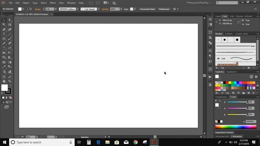
it's essential to set up your Adobe Illustrator workspace. This involves creating a new document with appropriate dimensions, ensuring your color mode is set to RGB for web use. Familiarize yourself with the toolbar, particularly the Pen Tool, Shape Tools, and Pathfinder panel, as these will be your primary instruments in crafting your logo. Ensure rulers are visible and snap to grid is enabled to make accurate shapes.
Crafting the Basic Shapes of the Logo
The first step in designing our logo is to create the fundamental shapes.
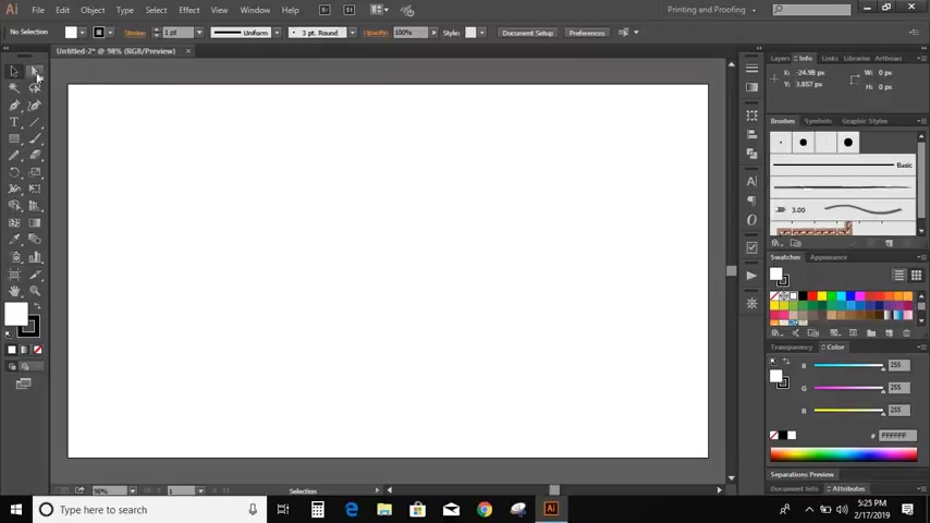
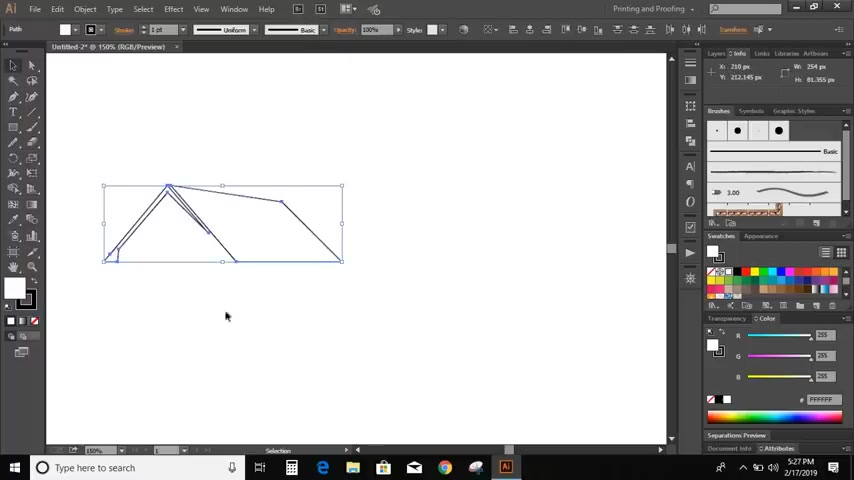
The Pen Tool is perfect for creating the roof of the houses that will form the basis of our logo. Using the pen tool, create an A shape, then a trapezoid shape next to each other. These can be combined to be more complex to create visual intrest. Remember to remove the stroke and fill the shapes with color. After the shapes are set, go to the rectangle tool to create the window, then use a rotate tool to make the window look more professional.
Creating a Window
Next we are going to draw a window using the rectangle tool
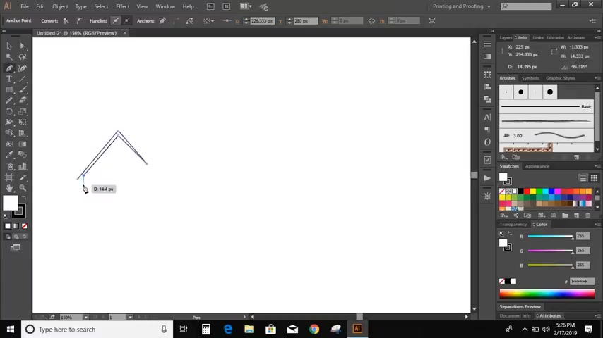
Click on Direct Selection Tool, select the upper two points, and drag it downwards. After we make the new rectangle, we're going to need two small rectangles that we will later subtract from the window object. Click the first rectangle, click the new shape, and align it to the center. Next select all the objects that form the window, then we want to use the Pathfinder tool, and we want to Minus Front, to where we are removing those rectangles from the object.
Designing the Landscape and Tree
No logo is complete without environmental elements. We will start by drawing a curved landscape line using the pen tool.
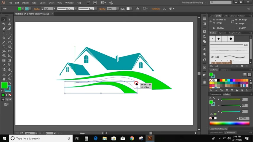
After this line is created, we want to choose the smooth tool, that can give it more of a polished look. Then we're going to want to duplicate this line, and change its location to make it an even better curve. We will finish up the bottom landscape with a rectangle behind the curves. Now we will move on to the tree, going back to our tool option and pencil tool, we can draw the tree shape. After we have our tree shape, we select the color and adjust the scale.
Adding Leaves and Final Touches
To give our tree some life, we are going to start by adding leaves
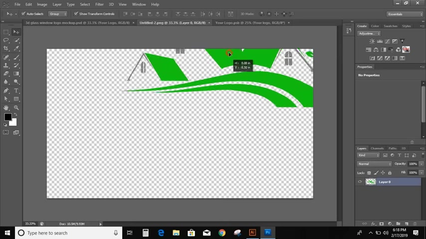
. For the leaves, we'll use the ellipse, then direct selection tool, and we select the upper node, then we select the lower node to manipulate it. To bring it all together, we are going to draw a rectangle, select all the images, shape builder tool, alt key, delete unwanted shapes and change the color to green. That's how you make a tree.
Tips for Logo Design
Keep it Simple
A logo should be easily recognizable and memorable. Avoid cluttering it with too many elements or intricate details. A clean, simple design is more versatile and effective.
Ensure Scalability
Your logo needs to look good whether it's displayed on a business card or a billboard. Design it in vector format so that it can be scaled without losing quality. Adobe Illustrator is designed for vector graphics, so your logo will always be high resolution.
Choose the Right Colors
Color is a powerful tool in branding.
Consider the psychology of color and choose colors that align with your brand's personality and values. Limit your color palette to a few key colors for a cohesive look.
Transparency is Key
A transparent logo is a vital step for a versatile brand. By exporting with transparency, your logo can be put over any background with ease.





Most people like





































Report
Please select a reason for reporting
- 13 Reasons to Switch from Snapchat to Text Messaging
- 7 Powerful Speech to Text Apps to Boost Productivity
- 10 Best Speech to Text Tools for Effortless Transcription
- 13 Free Tools to Easily Transcribe Audio to Text
- 15 Surprising Ways Google's Speech-to-Text Boosts Productivity
- 7 Best Free Online Audio to Text Transcription Tools
- 9 Tips to Transcribe Speech to Text Faster and Better
- 13 Best Speech to Text Software for Windows 10 in 2023
- 7 Tips for Choosing the Best Transcriber for Audio to Text
- 11 Reasons Why Dragon Speech-to-Text Apps are Game-Changers
- 6 Secrets to Enhance Your Speech to Text Transcription
- 6 Brilliant Ways to Boost Productivity with Talk-to-Text on Your MacBook
- 6 Ways Transcription Software Converts Audio to Text
- 8 Tips to Transcribe Speech to Text Like a Pro
- 6 Reasons IBM Watson Speech to Text is a Game-Changer
- 14 Powerful Ways Talk-to-Text Improves Your Workflow
- 12 Top Windows Speech-to-Text Software for Efficient Transcription
- 12 Game-Changing Benefits of Apple's Speech to Text Technology
- 9 Powerful Use Cases for AWS Speech to Text Technology
- 10 Easy Steps to Transcribe YouTube Videos to Text
- transcription audio en texte
- online audio transcription
- free audio file transcription
- free ai audio transcription
- audio transcription service
- audio transcription online free
- audio transcription free online
- audio to transcription software
- audio and transcript
- ai audio transcription free
- voice recording to text converter
- translate voice recording to text
- record voice to text
- audio recording to text converter
- voice recording and transcription
- chatgpt voice to text
- gmail voice to text
- speech to text reader
- speech to text ai free
- speech to talk
- Meshy AI: How to Create 3D Models from Text and Images
- How SEO and Marketing Dashboards Empower Agencies to Drive Results
- How to Use AI Tools to Find Internal Linking Opportunities Across a Business Website
- Discover Your Perfect Haircut with AI Hairstyle Apps
- Free Reputation Calculator Tools: How They're Adapting to Score AI Visibility, Not Just Rankings
- Design Professional Flyers for Free on Your Phone
- Best Free Flyer Maker Apps for Android: Design Like a Pro
- How to Know If Your Business Is Ready for an AI Customer Service Agent
- Revolutionizing Storytelling: From Novels to Screenplays with AI
- Create Engaging Animated Explainer Videos with a Free AI Tool
- Meshy AI: How to Create 3D Models from Text and Images
- ASOMobile Helps Teams Benchmark App Store Screenshots Against Competitors
- How to Match LMS Software With Your Organization's Training Plan
- Revolutionizing Email Marketing Agency with AI
- How to Convert BTC to HNT
- Unleashing the Power of AI: Cognizant's Roadmap for Transformation
- Frame to Video Review: A Practical Look at Turning Two Still Frames Into Motion
- NVIDIA NIM: Revolutionizing Supply Chain Data Analysis with AI
- Top AI Tools That Help Brands Stand Out Offline (Not Just Online)
- Top 5 Cold Email Software: Maximize Your Outreach in 2025

Copyright ©2026 toolify