






















Mastering Illustrator's Graph Tool: Visualizing Data Effectively

Updated on May 15,2025

Table of Contents

Adobe Illustrator's Graph Tool is a powerful feature that enables designers to create visually appealing and informative charts and graphs directly within the software. This tool goes beyond simple pie charts and bar graphs, offering a variety of options to represent data in a clear and engaging manner. By understanding how to use the Graph Tool effectively, designers can enhance their infographics, reports, presentations, and other visual communications, making complex information more accessible and understandable for their audience. This guide will help you master Illustrator's graph tool.

Key Points

The Graph Tool in Adobe Illustrator offers a wide range of graph types, including column, bar, line, area, scatter, and pie charts.

Data can be imported from various sources, such as spreadsheets, or entered manually into Illustrator's data window.

Customization options allow users to modify the appearance of graphs, including colors, fonts, labels, and axes.

Graph designs can be saved as templates for future use, ensuring consistency across multiple projects.

Illustrator's Graph Tool integrates seamlessly with other features, allowing for the creation of complex and visually stunning infographics.

Understanding data visualization principles is essential for creating effective and informative graphs.

Understanding the Graph Tool in Adobe Illustrator

What is the Graph Tool?

The Graph Tool in Adobe Illustrator is designed to allow users to create charts and graphs directly within their designs. Unlike using external spreadsheet programs and importing static images, Illustrator's Graph Tool lets you create dynamic and editable graphs that seamlessly integrate with your artwork.
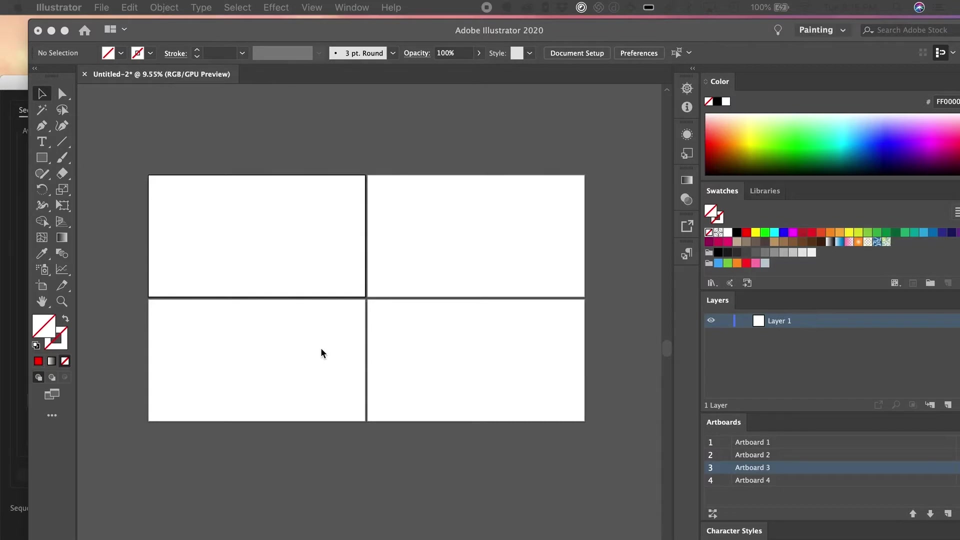
It offers different graph types, from basic pie charts to more complex radar charts. The advantage lies in Illustrator's vector-based environment, which means your graphs are scalable without any loss of quality. This tool is essential for creating infographics, data visualizations, and reports where visual Clarity and design coherence are paramount. Understanding the features is critical for conveying complex data sets in an easily digestible format. The Graph Tool provides customization options to match your brand's look and feel while maintaining accuracy in your representation. Therefore, designers and visual communicators can use this tool to enhance their content by presenting numerical information in an engaging and informative manner. It’s about making data tell a story, and the Graph Tool helps you do just that. You can create compelling visuals that engage your audience and make your message more persuasive.

Utilizing the Graph Tool effectively requires a foundational understanding of both Illustrator's interface and basic data visualization principles. From choosing the right graph type to properly labeling axes and data points, thoughtful application of the tool can significantly enhance the impact of your visual communication.

Graph Types Available

Illustrator's Graph Tool offers a variety of Chart types to suit different data visualization needs. Each type serves a unique purpose and is best suited for specific kinds of information. Here’s a breakdown:

  • Column Graph: Ideal for comparing different categories or groups over a single period.
  • Stacked Column Graph: Useful for illustrating the composition of categories and their total values.
  • Bar Graph: Similar to column graphs but oriented horizontally, making them suitable for categories with long labels.
  • Stacked Bar Graph: Mirrors the stacked column graph but in a horizontal format, emphasizing the breakdown of each category.
  • Line Graph: Excellent for showing trends and changes over time.
  • Area Graph: Highlights the magnitude of change over time, often used to represent cumulative totals.
  • Scatter Graph: Displays the relationship between two different variables, revealing correlations and Patterns.
  • Pie Chart: Represents proportions of a whole, ideal for showing percentages and relative sizes.
  • Radar Graph: Compares multiple characteristics of different items, useful for showcasing strengths and weaknesses.

The choice of chart type should depend on the nature of the data and the message you want to convey. Experimenting with different graph types can help you find the most effective way to Present your data. For instance, if you're comparing sales figures across different regions, a column graph might be the best option. If you want to show how a company's market share has changed over several years, a line graph would be more appropriate. By understanding the strengths and weaknesses of each graph type, you can make informed decisions that enhance the clarity and impact of your data visualizations.

Working with Data

Entering and Importing Data

The Graph Tool in Illustrator provides versatile options for inputting your data, catering to various sources and formats. You can either manually enter data directly into Illustrator or import data from external sources.

Manual Data Entry: After selecting a graph type, a data window will appear, allowing you to input your values. Each row typically represents a category or data point, while columns represent different series or variables. This method is suitable for smaller datasets or when you need to make quick adjustments.

Importing Data: For larger datasets, importing data from a spreadsheet is more efficient. Illustrator supports tab-delimited text files (.txt) or comma-separated value files (.csv). Prepare your data in a spreadsheet program like Microsoft Excel or Google Sheets, then save it in the appropriate format. When importing, ensure your data is properly formatted with clear headers and consistent delimiters.

Data Formatting: Ensure that numbers are correctly formatted, and labels are clear and concise. Misformatted data can lead to errors in your graph. Take advantage of Illustrator's options for sorting and transposing data to ensure it's represented correctly. Data cleaning may also be necessary to remove any inconsistencies or errors that could affect the accuracy of your graph. By mastering these data input methods, you can streamline the creation of graphs and visualizations, making your workflow more efficient and your data presentations more accurate.

Step-by-Step Guide: Creating a Pie Chart

Creating a Pie Chart

Creating a pie chart in Adobe Illustrator using the Graph Tool is a straightforward process that can greatly enhance your visual communications. Here’s a step-by-step guide:

  1. Select the Graph Tool: In the Tools panel, locate and select the Graph Tool. If the tool isn't visible, it may be nested under other tools. Click and hold on the visible tool to reveal a fly-out menu containing all the available graph types. Choose the Pie Graph Tool.
  2. Draw the Graph Area: Click and drag on your artboard to define the size of your pie chart. The size you choose will impact the overall appearance, so consider the layout of your design.
  3. Enter Data: A data entry window will appear. Input your data into the table. Each row represents a slice of the pie chart. The first column is typically for labels, and the Second column is for the corresponding values.
  4. Apply the Data: After entering your data, click the checkmark or press Enter to apply it to your pie chart. Illustrator will automatically generate the chart based on your input.
  5. Customize the Appearance: Use the Direct Selection Tool (A) to select individual slices of the pie chart. You can then change their colors, add gradients, or apply patterns to enhance the visual appeal.
  6. Add Labels and Legends: Use the Type Tool (T) to add labels to each slice, or create a legend that explains what each color represents. Position the labels and legend to ensure they are easy to read and don't clutter the chart.
  7. Adjust Chart Settings: Double-click on the Graph Tool in the Tools panel to access the Graph Options dialog box. Here, you can adjust settings such as the pie chart's radius, angle, and appearance of the data markers.
  8. Fine-Tune and Finalize: Make any final adjustments to the chart's layout, colors, and typography. Ensure that the chart is clear, accurate, and complements your overall design.
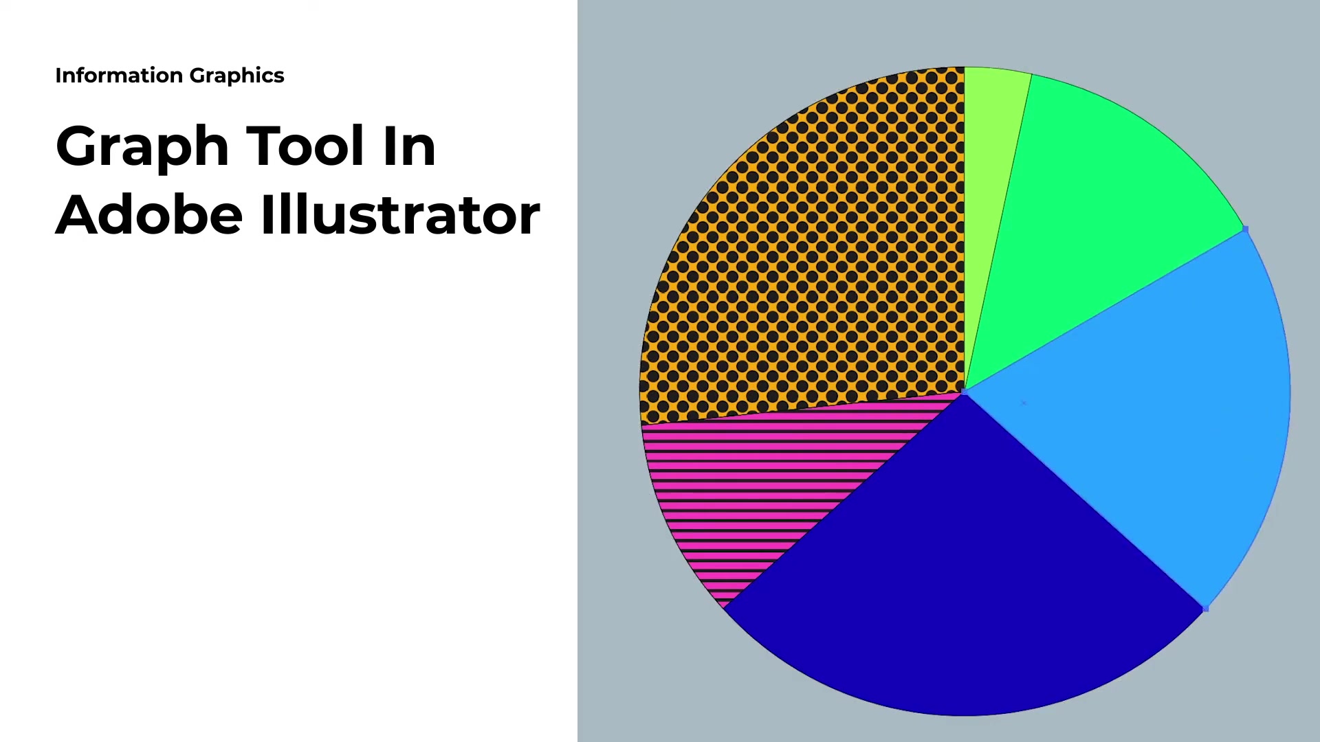
    Remember to save your work! By following these steps, you can create compelling and informative pie charts that effectively communicate your data in Adobe Illustrator.

Adobe Illustrator Pricing

Illustrator Subscription Plans

Adobe Illustrator is available through Adobe's Creative Cloud subscription service, which offers different plans to suit various user needs. Understanding the pricing structure can help you choose the plan that best fits your budget and requirements.

  • Single App Plan: This plan provides access to Adobe Illustrator and includes 100GB of cloud storage, Adobe Portfolio, Adobe Fonts, and Adobe Spark with premium features. It's an ideal option if Illustrator is the only Adobe application you need.
  • All Apps Plan: The All Apps plan includes access to over 20 Adobe creative apps, including Photoshop, InDesign, Premiere Pro, and more. It also comes with 100GB of cloud storage, Adobe Portfolio, Adobe Fonts, and Adobe Spark with premium features. This plan is suitable for users who require multiple Adobe applications.
  • Business Plans: Adobe offers business plans tailored to teams and organizations. These plans include additional features such as centralized administration, collaboration tools, and advanced support. Pricing for business plans varies depending on the number of users and specific requirements.
  • Student and Teacher Discount: Students and teachers are eligible for discounted pricing on Adobe Creative Cloud plans. This discount makes it more affordable for students and educators to access industry-standard creative tools.

Adobe frequently updates its pricing and plan options, so it's always a good idea to check the official Adobe website for the most current information. By exploring the different subscription plans, you can find an option that balances cost and functionality to meet your creative needs effectively.

Advantages and Disadvantages of Illustrator's Graph Tool

👍 Pros

Seamless integration with Adobe Illustrator's design environment.

High level of customization for graph elements and styles.

Vector-based output ensures scalability without loss of quality.

Ability to import data from various sources.

Versatile graph types for different data visualization needs.

Option to save graph styles as templates for future use.

👎 Cons

Limited data analysis capabilities compared to dedicated spreadsheet software.

Can be time-consuming for complex graphs or large datasets.

Requires a subscription to Adobe Creative Cloud.

Steeper learning curve for users unfamiliar with Illustrator.

Key Features of the Graph Tool

Advanced Customization Options

The Graph Tool in Adobe Illustrator goes beyond basic chart creation by offering advanced customization options that allow you to tailor your graphs to match your specific design requirements.

  • Styling Graph Elements: You can customize the appearance of individual graph elements, such as bars, columns, lines, and pie slices. Change their colors, add gradients, apply patterns, and adjust their stroke weights to create visually appealing charts.
  • Custom Axes: Illustrator allows you to modify the axes of your graphs, including the Scale, labels, and tick marks. Adjust the axis settings to accurately represent your data and improve readability.
  • Data Markers and Labels: Add data markers to highlight specific data points on your graph. Customize the appearance of the markers and add labels to provide additional information about each data point.
  • Typography Control: Control the typography of your graph labels, titles, and legends. Choose from a wide range of fonts, adjust the Font size, and customize the text color to ensure your graph is legible and visually consistent with your design.
  • Importing Custom Designs: You can import custom designs and symbols to use as data markers or graph elements. This feature allows you to create unique and branded graphs that stand out from the crowd.
  • Saving Graph Styles: Save your customized graph styles as templates for future use. This feature ensures consistency across multiple projects and saves you time when creating similar graphs. By taking advantage of these advanced customization options, you can create graphs that are not only informative but also visually stunning and perfectly aligned with your brand identity. These features enable you to transform raw data into compelling visual stories that captivate your audience and enhance your overall design.

Practical Applications of the Graph Tool

Illustrator's Graph Tool in Real-World Projects

The Graph Tool in Adobe Illustrator has a wide range of practical applications across various industries. Here are some examples of how you can use the Graph Tool in real-world projects:

  • Marketing Reports: Create visually appealing charts and graphs to present marketing data, such as website traffic, conversion rates, and campaign performance. Use column graphs to compare different marketing channels and line graphs to track trends over time.
  • Financial Reports: Visualize financial data, such as revenue, expenses, and profits, using bar graphs and pie charts. Create clear and concise charts to communicate financial performance to stakeholders.
  • Infographics: Enhance your infographics with data visualizations created using the Graph Tool. Combine charts and graphs with illustrations and text to create engaging and informative visual content.
  • Presentations: Incorporate graphs and charts into your presentations to support your arguments and make your data more accessible to your audience. Use animations and transitions to make your charts more dynamic and engaging.
  • Scientific Publications: Create accurate and visually appealing graphs for scientific publications, such as research Papers and journals. Use scatter graphs to analyze relationships between variables and line graphs to present experimental data.
  • Data Journalism: Visualize data for news articles and online publications. Create interactive charts and graphs that allow readers to explore the data and draw their own conclusions. By leveraging the Graph Tool in these and other real-world projects, you can transform raw data into compelling visual stories that inform, engage, and inspire your audience. The versatility and customization options of the Graph Tool make it an invaluable asset for designers, marketers, analysts, and anyone who needs to communicate data effectively.

Frequently Asked Questions

Can I import data from Excel directly into Illustrator's Graph Tool?
While you can't directly import an Excel (.xls or .xlsx) file into Illustrator, you can save your Excel data as a comma-separated value (.csv) or tab-delimited text (.txt) file and then import that file into the Graph Tool. Ensure your data is properly formatted with clear headers and consistent delimiters before saving.
How do I change the colors of individual bars in a column graph?
Use the Direct Selection Tool (A) to select individual bars in your column graph. Once selected, you can change their colors using the Color panel or Swatches panel. You can also apply gradients and patterns to the bars for added visual interest.
Can I create a graph with multiple data series in Illustrator?
Yes, Illustrator's Graph Tool supports multiple data series. When entering or importing your data, each column represents a different data series. The Graph Tool will automatically generate the graph with multiple series based on your input.
How do I add labels to the axes of my graph?
To add labels to the axes of your graph, double-click on the Graph Tool in the Tools panel to access the Graph Options dialog box. In the dialog box, you can specify the labels for the X and Y axes. You can also customize the appearance of the labels, such as the font, size, and color.
Is it possible to create 3D graphs in Illustrator?
While Illustrator is primarily a 2D vector graphics editor, you can create the illusion of 3D in your graphs by using gradients, shadows, and perspective effects. However, Illustrator does not have a built-in feature for creating true 3D graphs.
How do I ensure that my graph is accessible to people with disabilities?
To make your graph accessible, provide alternative text descriptions for each visual element, use sufficient color contrast, and ensure that the information is conveyed clearly even without color. You can also provide a data table as an alternative to the visual representation.

Related Questions

What are some common mistakes to avoid when creating graphs in Illustrator?
Creating effective graphs in Adobe Illustrator requires attention to detail and an understanding of data visualization principles. Here are some common mistakes to avoid: Choosing the wrong graph type: Selecting a graph type that doesn't suit your data can lead to confusion and misinterpretation. Ensure you choose the most appropriate graph type for the message you want to convey. Cluttering the graph: Too much information can make your graph difficult to read and understand. Avoid overcrowding your graph with excessive labels, data points, and visual elements. Using too many colors: While color can enhance your graph, using too many colors can be distracting and confusing. Stick to a limited color palette and use colors consistently to represent different data series. Ignoring accessibility: Neglecting accessibility can exclude people with disabilities from understanding your graph. Provide alternative text descriptions, use sufficient color contrast, and ensure the information is conveyed clearly even without color. Distorting the data: Manipulating the scale or axes of your graph can distort the data and mislead your audience. Ensure that your graph accurately represents the data and avoids any unintentional bias. Not proofreading: Errors in your graph labels, titles, and data points can undermine its credibility. Always proofread your graph carefully to ensure accuracy and clarity. Failing to tell a story: A good graph should tell a story and provide insights into the data. Avoid creating graphs that are purely decorative and focus on conveying meaningful information to your audience. By avoiding these common mistakes, you can create graphs that are not only visually appealing but also informative, accurate, and accessible.

Most people like