































Table of Contents
- Key Points
- Introduction to Excel AI Data Analysis
- Creating Pivot Tables and Charts with Analyze Data
- Step-by-Step Guide: Using Excel AI's Data Analysis Features
- Advantages and Disadvantages of Excel AI Data Analysis
- Frequently Asked Questions
- Related Questions


Introduction to Excel AI Data Analysis
What is Excel AI's Analyze Data Feature?
Excel AI's Analyze Data feature is designed to help users quickly understand their data. It automatically scans your data, identifies Patterns, and suggests insightful ways to Visualize the information using charts and pivot tables. This feature is accessible via the Analyze Data button located in the Home ribbon.
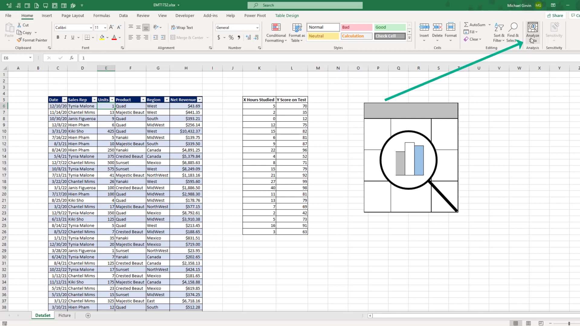
It provides a streamlined way to uncover Hidden trends and relationships within your datasets, saving you significant time and effort.
The tool leverages artificial intelligence to understand your data structure and content, offering relevant suggestions that you might not have considered otherwise. This is particularly useful for those who are not expert data analysts but still need to make sense of complex information. The suggestions provided are tailored to the specific dataset, ensuring that the insights are both Relevant and actionable.
By using the Analyze Data feature, you can bypass the often tedious and time-consuming process of manually creating charts and pivot tables. The AI does the heavy lifting, allowing you to focus on interpreting the results and making informed decisions. This democratization of data analysis empowers a wider range of users to extract value from their data.
Key Benefits of Using Analyze Data:
- Time-Saving: Quickly generates charts and pivot tables.
- Insightful Suggestions: Offers visualizations you might not have considered.
- User-Friendly: Simplifies data analysis for non-experts.
- Customizable: Allows further refinement of AI-generated outputs.
This feature represents a significant step forward in making data analysis more accessible and efficient for everyone using Excel.
Why Learn Manual Data Analysis?
While Excel AI's Analyze Data feature is incredibly useful, understanding the underlying principles of manual data analysis remains crucial. If you don’t understand how the calculations are created, you don’t have full control over the process.
Manual analysis provides a deeper understanding of your data, allowing you to validate AI-driven insights and customize your analysis to specific needs.
Knowing how to create pivot tables, charts, and perform statistical calculations by HAND ensures that you can critically evaluate the suggestions provided by the AI. You can identify potential biases or inaccuracies and adjust your analysis accordingly. This level of control is essential for ensuring the reliability and validity of your findings.
Furthermore, manual data analysis skills are invaluable when dealing with datasets that the AI might struggle with, such as those with complex structures or unique requirements. By mastering manual techniques, you can adapt your approach to overcome these challenges and extract Meaningful insights.
Benefits of Manual Data Analysis:
- Deeper Understanding: Grasp the underlying principles and calculations.
- Enhanced Control: Customize analysis to specific requirements.
- Validation of AI Insights: Critically evaluate AI-driven suggestions.
- Adaptability: Handle complex or unique datasets.
Therefore, while embracing the efficiency of Excel AI, it's important not to overlook the foundational skills of manual data analysis. These skills provide the context and expertise needed to fully leverage the power of Excel AI and ensure the accuracy of your data-driven decisions.
Creating Pivot Tables and Charts with Analyze Data
Generating a Pivot Table
Excel AI makes generating pivot tables incredibly simple. Here’s how you can do it:
-
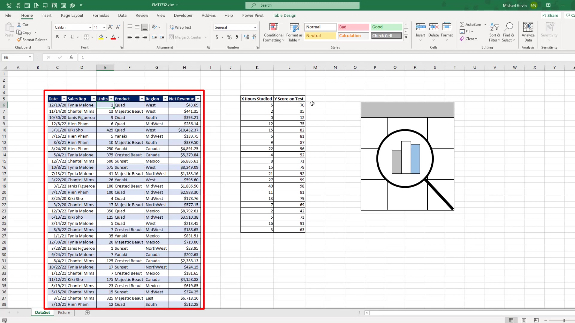
Select Your Data: Click on any cell within your sales table. Ensure your data is well-structured with clear headers for each column.
-
Access Analyze Data: Click the Analyze Data button on the Home ribbon. Excel AI will start analyzing your data and provide suggestions.
-
Choose a Suggestion: Review the suggested pivot tables. For instance, you might see a suggestion like “Net Revenue by Region and Product.”
-
Insert the Pivot Table: Click the Insert PivotTable button below the suggestion. Excel will create a new sheet with the pivot table, giving you a cross-tabulated report automatically.
By following these steps, you can quickly create a pivot table that summarizes your data, helping you identify key trends and insights without the need for manual configuration.
Example:
| Region | Product | Net Revenue |
|---|---|---|
| Midwest | Quad | \$669,525.30 |
| Midwest | Majestic Beast | \$516,872.50 |
| Mexico | Quad | \$610,462.84 |
| Mexico | Majestic Beast | \$501,179.47 |
| West | Quad | \$549,593.18 |
| West | Majestic Beast | \$486,671.71 |
| Northwest | Quad | \$497,157.09 |
| Northwest | Majestic Beast | \$405,716.01 |
| Canada | Quad | \$525,647.62 |
| Canada | Majestic Beast | \$349,588.41 |
This table shows the net revenue broken down by region and product, giving you a clear overview of your sales performance.
Creating a Pivot Chart
Creating pivot charts is just as easy as creating pivot tables with Excel AI. Here’s how:
-
Select Your Data: Ensure you're still within your sales data table.
-
Access Analyze Data: Click the Analyze Data button again.
-
Choose a Suggestion: Look for a suggestion that includes a Chart. For example, “Net Revenue by Product.”
-
Insert the Pivot Chart: Click the Insert PivotChart button. Excel will add a new sheet with both a pivot table and a pivot chart.
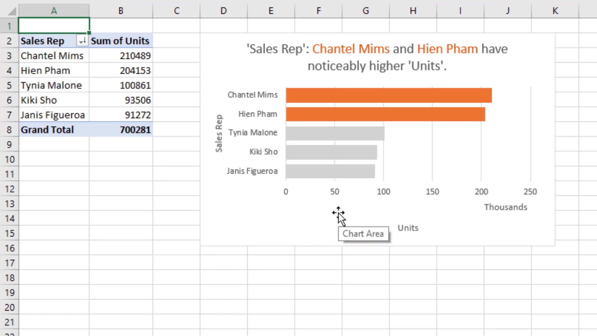
What’s impressive is that Excel AI often formats the chart for you, including labels, axes, and units. In the example, it formats the net revenue in millions, adding a label for Clarity. This eliminates the need for manual formatting, saving you even more time.
Example:
| Product | Sum of Net Revenue |
|---|---|
| Quad | \$3,941,523.35 |
| Majestic Beast | \$3,123,364.86 |
| Yanaki | \$2,402,500.36 |
| Crested Beaut | \$2,254,976.67 |
| Sunset | \$2,161,812.65 |
This table is paired with a horizontal bar chart showing the same data, allowing for quick visual analysis.
Generating an XY Scatter Plot
Excel AI can also create more complex charts, such as XY scatter plots, which are useful for analyzing relationships between two variables. Here’s how to create one:
- Select Your Data: This time, click on the table containing your XY data. Ensure you have two columns of numerical data.
- Access Analyze Data: Click the Analyze Data button.
- Choose a Suggestion: Look for a suggestion that includes an XY scatter plot. Excel AI might suggest a chart that shows the correlation between “X Hours Studied” and “Y Score on Test.”
- Insert the Chart: Click the Insert Chart button. Excel will add the XY scatter plot directly into your sheet.
Excel AI's ability to generate XY scatter plots can be a massive time-saver, especially for statistics and data analysis tasks. This feature simplifies the process of visualizing correlations and trends in your data.
Unlike the pivot table and pivot chart, Excel generates the XY Scatter plot without creating a pivot table first. This function will also create a horizontal graph and a histogram if it recognizes a need for it.








Most people like






































Report
Please select a reason for reporting
- 13 Reasons to Switch from Snapchat to Text Messaging
- 7 Powerful Speech to Text Apps to Boost Productivity
- 10 Best Speech to Text Tools for Effortless Transcription
- 13 Free Tools to Easily Transcribe Audio to Text
- 15 Surprising Ways Google's Speech-to-Text Boosts Productivity
- 7 Best Free Online Audio to Text Transcription Tools
- 9 Tips to Transcribe Speech to Text Faster and Better
- 13 Best Speech to Text Software for Windows 10 in 2023
- 7 Tips for Choosing the Best Transcriber for Audio to Text
- 11 Reasons Why Dragon Speech-to-Text Apps are Game-Changers
- 6 Secrets to Enhance Your Speech to Text Transcription
- 6 Brilliant Ways to Boost Productivity with Talk-to-Text on Your MacBook
- 6 Ways Transcription Software Converts Audio to Text
- 8 Tips to Transcribe Speech to Text Like a Pro
- 6 Reasons IBM Watson Speech to Text is a Game-Changer
- 14 Powerful Ways Talk-to-Text Improves Your Workflow
- 12 Top Windows Speech-to-Text Software for Efficient Transcription
- 12 Game-Changing Benefits of Apple's Speech to Text Technology
- 9 Powerful Use Cases for AWS Speech to Text Technology
- 10 Easy Steps to Transcribe YouTube Videos to Text
- transcription audio en texte
- online audio transcription
- free audio file transcription
- free ai audio transcription
- audio transcription service
- audio transcription online free
- audio transcription free online
- audio to transcription software
- audio and transcript
- ai audio transcription free
- voice recording to text converter
- translate voice recording to text
- record voice to text
- audio recording to text converter
- voice recording and transcription
- chatgpt voice to text
- gmail voice to text
- speech to text reader
- speech to text ai free
- speech to talk
- How SEO and Marketing Dashboards Empower Agencies to Drive Results
- How to Use AI Tools to Find Internal Linking Opportunities Across a Business Website
- Discover Your Perfect Haircut with AI Hairstyle Apps
- Free Reputation Calculator Tools: How They're Adapting to Score AI Visibility, Not Just Rankings
- Design Professional Flyers for Free on Your Phone
- Best Free Flyer Maker Apps for Android: Design Like a Pro
- How to Know If Your Business Is Ready for an AI Customer Service Agent
- Revolutionizing Storytelling: From Novels to Screenplays with AI
- Create Engaging Animated Explainer Videos with a Free AI Tool
- Stop Multi-Subscribing: Benchmark Top AI Visual Models in One Canvas
- ASOMobile Helps Teams Benchmark App Store Screenshots Against Competitors
- How to Match LMS Software With Your Organization's Training Plan
- Revolutionizing Email Marketing Agency with AI
- How to Convert BTC to HNT
- Unleashing the Power of AI: Cognizant's Roadmap for Transformation
- Frame to Video Review: A Practical Look at Turning Two Still Frames Into Motion
- NVIDIA NIM: Revolutionizing Supply Chain Data Analysis with AI
- Top AI Tools That Help Brands Stand Out Offline (Not Just Online)
- Top 5 Cold Email Software: Maximize Your Outreach in 2025
- Magic School AI: Revolutionizing Quiz & Assessment Generation

Copyright ©2026 toolify