






























Table of Contents
- Key Points
- Designing Your Letters
- Preparing and Importing SVG Files
- Finalizing the Font in FontLab Studio
- FAQ
- Related Questions


Designing Your Letters
Choosing Your Design Software
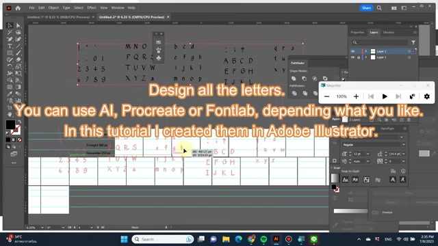
The first step in creating a custom Font is designing each letter, number, and symbol. Fortunately, there are multiple programs that can be useful. You could use Adobe Illustrator, Procreate, or even FontLab Studio. The program that you pick is up to you, depending on which program you are more familiar with or simply prefer.
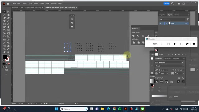
Adobe Illustrator, a popular choice in the industry, is favored for its precision and vector-based tools. This ensures your letters remain crisp and scalable, regardless of size. Procreate, on the other HAND, provides a more intuitive and hands-on approach, ideal if you enjoy sketching and refining your designs directly on a tablet. Alternatively, FontLab Studio also has tools to create your letters inside the software itself, eliminating the need to use any other program. All of the programs can be used to get the job done, so experiment and find the best option for you.
Setting Up Artboards for Each Character
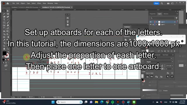
Proper artboard setup is essential for consistent letter sizing and proportions across the font. In this Tutorial, we'll create artboards for each letter, with dimensions of 1000x1000 pixels. Ensure consistent Dimensions for each artboard.
Within your design software, create individual artboards (or canvases) for every character you plan to include in your font – uppercase and lowercase letters, numbers, punctuation, and any special symbols. The size you choose will depend on the desired resolution of your final font, but a standard size like 1000x1000 pixels provides ample space for detailed design. A GRID setup for designing the individual letters will also be needed. This allows for consistency and will make the process easier when importing the letters into FontLab Studio later.
Arranging and Scaling Individual Artboards
After setting up the grid and artboards, arrange the characters to match a keyboard layout. It can be difficult to determine what each artboard represents if the artboards aren’t labeled and ordered appropriately. Scaling each letter with the grid can be done in your program of choice and will help ensure that the letters work well together when imported into FontLab Studio later. Properly scaling the letters and artboards will make font creation easier in the later stages.
Preparing and Importing SVG Files
Exporting Your Letters as SVGs
The next step is exporting the character designs you have made for your font into SVG files that will be used with FontLab Studio.
Once your letters are designed and properly sized on their respective artboards, export each one as an SVG (Scalable Vector Graphics) file. When exporting, be absolutely certain that you select the 'Use Artboards' option.
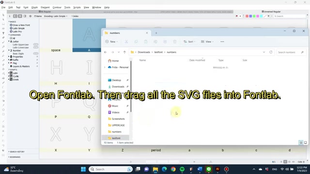
This ensures that each letter is exported individually, cropped to the bounds of its artboard. This step is absolutely crucial for proper font creation in FontLab Studio. The resulting individual svg files will be named based on their artboard, so be sure to name each artboard with the appropriate character designation. This is one of the most important steps in the SVG exporting process, so take your time and be careful.
Renaming SVG Files for FontLab Studio
Naming your SVG files is a very important aspect of the SVG export process. The names that you choose are what will determine the characters that your letters represent when you import them into FontLab Studio. This means that when you name your SVG files, you must ensure that the names match the glyph names recognized by FontLab Studio. This may sound confusing, but all you need to do is ensure you are using the correct names. A list of these glyph names can be found in FontLab Studio.
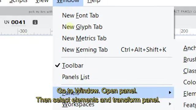
Make sure each uppercase letter is named correctly, each lowercase letter is named correctly, each number is named correctly, and each special character is named correctly.
Importing SVG Files Into FontLab Studio
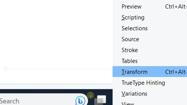
After renaming the SVG files, it's time to import them into FontLab Studio. Once you launch the program and make a new font, you will be presented with a window containing spaces for your letters. All you need to do now is drag and drop the SVG files you previously created into their appropriate spaces. Once they are in the program, there are still a few adjustments you must make, so make sure you follow the next steps closely.
Finalizing the Font in FontLab Studio
Adjusting the Baseline
After importing your characters, you must adjust the baseline. The baseline is the imaginary line upon which most letters rest. Some programs do not automatically set it, so you must do so yourself to make the font work correctly. To do this:
-
Double-click a letter to open it.
-
In the top-left, select ‘Tool’.
-
Then, select ‘Commands and Shortcuts’.
-
A window will pop up that allows you to search for commands. In this window, type ‘make SVG editable’ and click ‘Go’ when it appears.
-
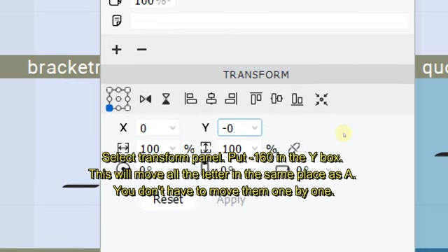
After doing this, select ‘window’ in the top-left. Then, go to ‘panels’ and select ‘elements’ and ‘transform panel’.
-
When the transform panel appears, you will have to check the Y coordination in the element panel.
-
Then, move the character to meet the baseline to that number. The specific number to use depends on the character set you are using.
-
After this, go back to the main workspace. Then, select all the characters by holding down shift and selecting the glyphs (except for the character you already moved). In the transform panel, put -160 in the Y box and click apply. This will move all the letters to the same place as the first character, saving you from having to do them one by one.
Adjusting Metrics and Kerning
Metrics and kerning are important aspects of your font’s design because they greatly affect readability and visual appeal. To accomplish this, you will need to adjust the spacing between characters. The space between the characters should be visually pleasing and balanced. To do this:
- Select all the characters again.
- Then, select ‘edit metrics’.
- Click on each character and then hit the diamond button for the automatic adjustment of tracking. This will help space the characters appropriately.
- After this, select ‘window’, and then select ‘new kerning tab’. This opens the kerning tab, allowing you to see the font in action.
- After this, select ‘window’ again, then ‘panels’ and then find ‘pairs and phrases’. This will allow you to select what text is shown so that you can better preview your font.
Finally, in the bottom of the ‘pairs and phrases panel’ there are options of kerning pairs or Texts to select. You can adjust the distances individually or adjust all the pairs with the same letter simultaneously to make your letter easier to read.
Exporting Your Font
Once you have finalized all the steps for your font creation, you can export your font for use. To do this:
- Select ‘file’ and then ‘export font as’.
- Select ‘OTF’ (OpenType Font) for broad compatibility, and choose Where To save the exported file. Then, click ‘export button’. hree. Congratulations! Your custom font is now ready to be used in various design applications.





Most people like

































Report
Please select a reason for reporting
- 13 Reasons to Switch from Snapchat to Text Messaging
- 7 Powerful Speech to Text Apps to Boost Productivity
- 10 Best Speech to Text Tools for Effortless Transcription
- 13 Free Tools to Easily Transcribe Audio to Text
- 15 Surprising Ways Google's Speech-to-Text Boosts Productivity
- 7 Best Free Online Audio to Text Transcription Tools
- 9 Tips to Transcribe Speech to Text Faster and Better
- 13 Best Speech to Text Software for Windows 10 in 2023
- 7 Tips for Choosing the Best Transcriber for Audio to Text
- 11 Reasons Why Dragon Speech-to-Text Apps are Game-Changers
- 6 Secrets to Enhance Your Speech to Text Transcription
- 6 Brilliant Ways to Boost Productivity with Talk-to-Text on Your MacBook
- 6 Ways Transcription Software Converts Audio to Text
- 8 Tips to Transcribe Speech to Text Like a Pro
- 6 Reasons IBM Watson Speech to Text is a Game-Changer
- 14 Powerful Ways Talk-to-Text Improves Your Workflow
- 12 Top Windows Speech-to-Text Software for Efficient Transcription
- 12 Game-Changing Benefits of Apple's Speech to Text Technology
- 9 Powerful Use Cases for AWS Speech to Text Technology
- 10 Easy Steps to Transcribe YouTube Videos to Text
- transcription audio en texte
- online audio transcription
- free audio file transcription
- free ai audio transcription
- audio transcription service
- audio transcription online free
- audio transcription free online
- audio to transcription software
- audio and transcript
- ai audio transcription free
- voice recording to text converter
- translate voice recording to text
- record voice to text
- audio recording to text converter
- voice recording and transcription
- chatgpt voice to text
- gmail voice to text
- speech to text reader
- speech to text ai free
- speech to talk
- How to Use AI Tools to Find Internal Linking Opportunities Across a Business Website
- Discover Your Perfect Haircut with AI Hairstyle Apps
- Free Reputation Calculator Tools: How They're Adapting to Score AI Visibility, Not Just Rankings
- Design Professional Flyers for Free on Your Phone
- Best Free Flyer Maker Apps for Android: Design Like a Pro
- How to Know If Your Business Is Ready for an AI Customer Service Agent
- Revolutionizing Storytelling: From Novels to Screenplays with AI
- Create Engaging Animated Explainer Videos with a Free AI Tool
- Stop Multi-Subscribing: Benchmark Top AI Visual Models in One Canvas
- Best Seedance 2.5 API Provider: Every Price on the Market, Checked at Source
- Top AI Social Media Management Tools: Automate Your Content Strategy
- Free AI Text to Video Generator: Create Stunning Videos from Text
- Discover 17 ChatGPT Alternatives: A Comprehensive Comparison
- Character.AI vs. Janitor AI: Which AI Chat Platform Reigns Supreme?
- Top Virtual Assistant Companies in 2026: Reviews, Pricing, and Plans Compared
- Unveiling FaceCheck.ID: Revolutionizing Reverse Image Searches with AI
- 11 Best AI Dialers in 2026: Features, Pricing, Pros and Cons
- How I Direct Consistent AI Clips: A Hands-On Guide to Multi-Model Generation
- A Realistic Review of the Photo Generator Image Tool
- Playwright MCP Server: Automated Web Testing with Agent Mode

Copyright ©2026 toolify