































Table of Contents
- Key Points
- Introduction to Mapping with Microsoft Excel
- Step-by-Step Guide: Plotting Coordinates on a Map
- How to Utilize Your Excel Map
- Pros and Cons of Using Excel 3D Maps
- FAQ
- Related Questions


Introduction to Mapping with Microsoft Excel
Why Use Excel for Mapping?
Microsoft Excel, often associated with spreadsheets and data analysis, offers powerful mapping capabilities through its 3D Maps feature.
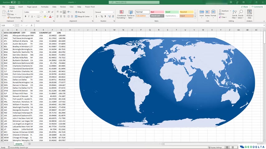
This allows users to plot XY coordinates or, more specifically, latitude and longitude values directly onto a map without relying on external GIS software like QGIS, ArcGIS, or Google Earth Pro. For professionals and enthusiasts who routinely work with geospatial data, mastering Excel's mapping tools can significantly streamline workflows. Excel provides a user-friendly environment for data preparation, manipulation, and visualization, making it an accessible tool for a wide range of mapping applications. For tasks that don't require advanced GIS functionalities, Excel offers a convenient and efficient alternative. The example used in this Tutorial utilizes airport data, but the principles can be applied to any dataset containing location coordinates. Working within Excel allows for seamless integration with existing data workflows, eliminating the need to import and export data between different platforms. This approach is particularly beneficial for projects that require quick data analysis and visualization without the complexity of full-fledged GIS software.
Data Preparation for Mapping
Before diving into the mapping process, it's crucial to prepare your data correctly.
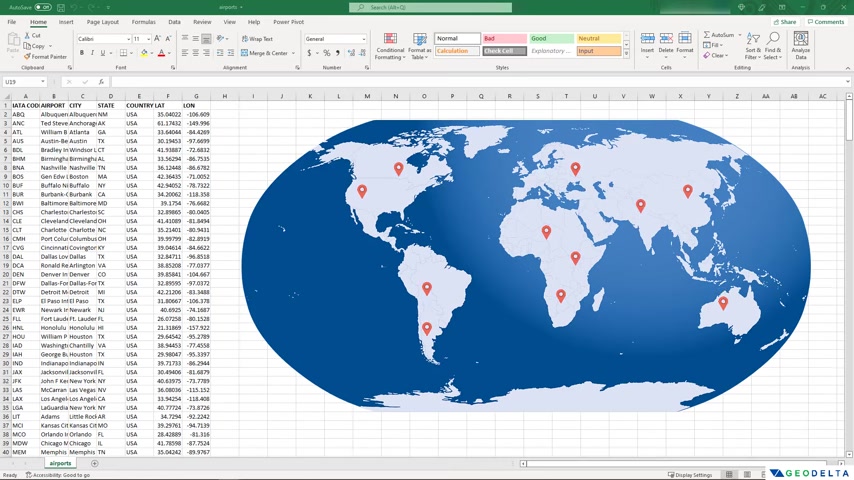
The example dataset, downloaded from Kaggle, includes information about airports in the United States, with columns for IATA code, airport name, city, state, country, latitude, and longitude. To ensure optimal compatibility with Excel's mapping tools, it’s recommended to convert your data range into a formal Excel table. Here's how:
- Select the Entire Dataset: Click and drag your mouse to highlight all the data you wish to map.
- Format as Table: On the 'Home' tab, locate the 'Format as Table' button in the styles group and select a table style that you like. Choose a light style to have increased readability.
- Confirm Table Creation: Excel will ask you to confirm the data range for your table. Verify the range is correct and ensure the 'My table has headers' box is checked if your data includes column headers. Click 'OK'.
Converting the data into a table format allows Excel to recognize and manage the data more effectively. This step ensures that when you use the 3D Maps feature, Excel can accurately identify and plot the location data.
Once you created a table, you can delete filter buttons that excel creates by default.
Ensuring that your dataset includes consistent and accurate latitude and longitude data is essential for successful map plotting. Incorrect or missing coordinate values can lead to inaccurate or incomplete map visualizations.
Step-by-Step Guide: Plotting Coordinates on a Map
Accessing the 3D Maps Feature
Excel's 3D maps is the key to our process. After organizing the data into an Excel table, follow these steps to plot the coordinates:
- Select the Table: Click on any cell within the table to activate the table, then select the whole table by using Ctrl + A.
- Insert 3D Map: Go to the 'Insert' tab on the Excel ribbon. In the 'Charts' group, you'll find the '3D Maps' option. Expand the dropdown menu and select 'Open 3D Maps'.
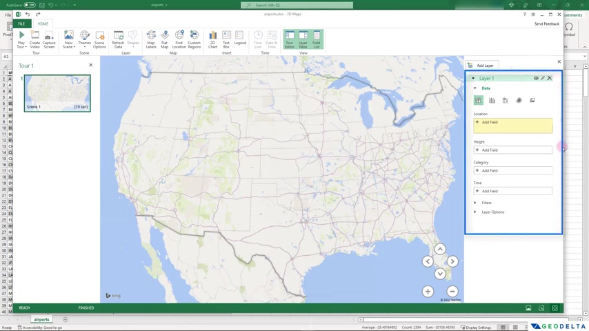
This action will launch a separate 3D Maps window, displaying a global view of the world. You can use the controls on the right of the screen for location, heights, categories, time etc. The secondary window allows you to work with a set of data for data analysis.
Configuring the Layer Panel
The Layer Panel is crucial for controlling how your data is displayed on the map.
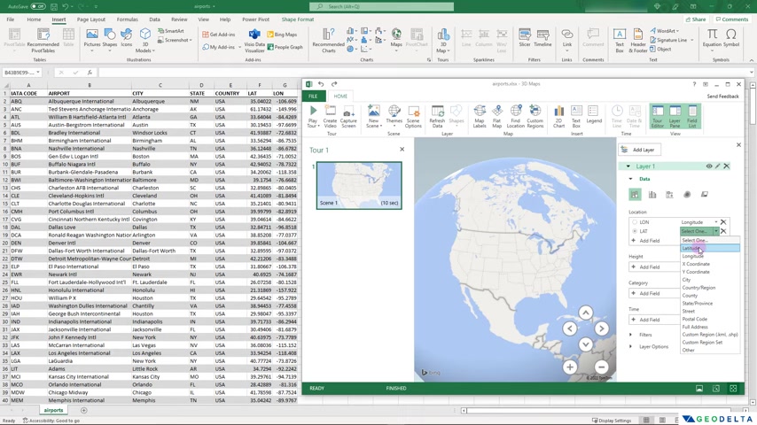
Here's how to configure it:
- Setting the Location: In the 'Layer Panel' on the right-hand side, you'll see options for 'Location'. Click add field on the location.
- Specify Latitude and Longitude: Select the 'Latitude' field from your data for the latitude coordinate and the 'Longitude' field for the longitude coordinate. Map excel column that contains Latitude to latitude in Location filed. Map excel column that contains Longitude to Longitude in Location filed. This action tells Excel which columns in your data contain the geographical coordinates.
- Choose a Visualization Style: Excel often defaults to visualizing the plotted data as clustered columns. By clicking change the visualization to bubble option.
With these configurations, Excel will accurately plot each coordinate from your dataset onto the map, providing a visual representation of the geographical distribution.
Customizing Visual Elements
You can customize your map visualization in a number of ways. The goal is to create a compelling and informative visual. Here are some tips.
- Adjusting Bubble Sizes: In the 'Layer Options' section of the 'Layer Panel', you can change the size of the displayed points to get the best visual outcome. Adjusting the size makes it easier to differentiate points.
- Changing the Opacity: Adjusting the opacity from here. A low opacity will highlight concentrations on the map. By decreasing the opacity, it creates a unique visual with different highlights.
- Color Coding by Category: Try using categories to give points their colour. This option is a good idea if the column you categorized for color contains states. Because it provides you with an immediate visual indicator of states.
Customizing these visual elements will enhance the clarity and impact of your map, allowing you to effectively communicate the spatial patterns in your data.
Customize Data Card Options
The default setup in excel 3d maps displays only latitude and longitude value. This customization will help display information you want to display when hovering over a point in map.
- From Right-hand side panel, choose Data Card. Click on customize, and follow next steps.
- From left panel choose the data to display when hovered over the point.
- From right panel set what to display the way you want the display to look.
As long as you provide your data in specific format, excel will recognize and show the correct data that is associated with the co-ordinates.








Most people like

































Report
Please select a reason for reporting
- 13 Reasons to Switch from Snapchat to Text Messaging
- 7 Powerful Speech to Text Apps to Boost Productivity
- 10 Best Speech to Text Tools for Effortless Transcription
- 13 Free Tools to Easily Transcribe Audio to Text
- 15 Surprising Ways Google's Speech-to-Text Boosts Productivity
- 7 Best Free Online Audio to Text Transcription Tools
- 9 Tips to Transcribe Speech to Text Faster and Better
- 13 Best Speech to Text Software for Windows 10 in 2023
- 7 Tips for Choosing the Best Transcriber for Audio to Text
- 11 Reasons Why Dragon Speech-to-Text Apps are Game-Changers
- 6 Secrets to Enhance Your Speech to Text Transcription
- 6 Brilliant Ways to Boost Productivity with Talk-to-Text on Your MacBook
- 6 Ways Transcription Software Converts Audio to Text
- 8 Tips to Transcribe Speech to Text Like a Pro
- 6 Reasons IBM Watson Speech to Text is a Game-Changer
- 14 Powerful Ways Talk-to-Text Improves Your Workflow
- 12 Top Windows Speech-to-Text Software for Efficient Transcription
- 12 Game-Changing Benefits of Apple's Speech to Text Technology
- 9 Powerful Use Cases for AWS Speech to Text Technology
- 10 Easy Steps to Transcribe YouTube Videos to Text
- transcription audio en texte
- online audio transcription
- free audio file transcription
- free ai audio transcription
- audio transcription service
- audio transcription online free
- audio transcription free online
- audio to transcription software
- audio and transcript
- ai audio transcription free
- voice recording to text converter
- translate voice recording to text
- record voice to text
- audio recording to text converter
- voice recording and transcription
- chatgpt voice to text
- gmail voice to text
- speech to text reader
- speech to text ai free
- speech to talk
- How to Use AI Tools to Find Internal Linking Opportunities Across a Business Website
- Discover Your Perfect Haircut with AI Hairstyle Apps
- Free Reputation Calculator Tools: How They're Adapting to Score AI Visibility, Not Just Rankings
- Design Professional Flyers for Free on Your Phone
- Best Free Flyer Maker Apps for Android: Design Like a Pro
- How to Know If Your Business Is Ready for an AI Customer Service Agent
- Revolutionizing Storytelling: From Novels to Screenplays with AI
- Create Engaging Animated Explainer Videos with a Free AI Tool
- Stop Multi-Subscribing: Benchmark Top AI Visual Models in One Canvas
- Best Seedance 2.5 API Provider: Every Price on the Market, Checked at Source
- Top AI Social Media Management Tools: Automate Your Content Strategy
- Free AI Text to Video Generator: Create Stunning Videos from Text
- Discover 17 ChatGPT Alternatives: A Comprehensive Comparison
- Character.AI vs. Janitor AI: Which AI Chat Platform Reigns Supreme?
- Top Virtual Assistant Companies in 2026: Reviews, Pricing, and Plans Compared
- Unveiling FaceCheck.ID: Revolutionizing Reverse Image Searches with AI
- 11 Best AI Dialers in 2026: Features, Pricing, Pros and Cons
- How I Direct Consistent AI Clips: A Hands-On Guide to Multi-Model Generation
- A Realistic Review of the Photo Generator Image Tool
- Playwright MCP Server: Automated Web Testing with Agent Mode

Copyright ©2026 toolify