































Table of Contents
- Key Points
- Introduction to Excel Charts and Graphs
- Creating Charts and Graphs in Excel: A Step-by-Step Guide
- Microsoft Excel Pricing
- Excel Charting: Pros and Cons
- Key Features of Excel for Data Visualization
- Real-World Use Cases for Excel Charts and Graphs
- Frequently Asked Questions about Excel Charts and Graphs
- Related Questions


Introduction to Excel Charts and Graphs
Why Data Visualization Matters
Data visualization is the graphical representation of information and data. By using visual elements like charts, graphs, and maps, data visualization tools provide an accessible way to see and understand trends, outliers, and patterns in data. In Excel, effective data visualization can transform spreadsheets full of numbers into compelling stories. Visualizing your data helps identify trends, Patterns, and outliers more effectively than simply looking at rows and columns of numbers. Good visuals make complex information easier to digest and understand, whether you’re presenting to colleagues, stakeholders, or clients.
Data visualization is crucial for several reasons:
- Improved Understanding: Visual representations make complex data more accessible and easier to understand.
- Enhanced Decision-Making: By identifying trends and patterns, data visualization enables informed decision-making.
- Effective Communication: Charts and graphs are powerful tools for communicating insights to various audiences, regardless of their technical expertise.
- Better Data Exploration: Visualizations allow for a more intuitive exploration of data, uncovering Hidden relationships and opportunities.
In the modern business environment, the ability to quickly and accurately interpret data is a significant competitive advantage. Excel's charting tools, particularly when enhanced by AI, empower users to achieve this with ease and precision.
Overview of Excel's Charting Capabilities
Microsoft Excel offers a wide array of Charting capabilities, from basic charts like bar graphs and pie charts to more complex visualizations such as scatter plots and heat maps. These charts can be customized extensively to meet specific analytical and presentation needs.
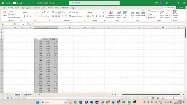
With the integration of AI, Excel can even suggest the most appropriate chart types based on the data you've selected, streamlining the visualization process. This AI assistance not only saves time but also helps users discover Chart types they might not have considered otherwise.
Excel's charting functionalities include:
- Basic Charts: Column, bar, line, pie, and area charts for straightforward data representation.
- Advanced Charts: Scatter plots, histograms, box plots, and treemaps for more complex analyses.
- Customization Options: Extensive formatting tools to adjust colors, labels, axes, and more.
- AI-Driven Recommendations: Intelligent suggestions for chart types based on data characteristics.
- Interactive Elements: Features like slicers and pivot charts for dynamic data exploration.
Excel's intuitive interface and robust feature set make it an indispensable tool for anyone working with data. Whether you are a seasoned analyst or a beginner, Excel provides the resources to create impactful and informative visualizations.
Creating Charts and Graphs in Excel: A Step-by-Step Guide
Selecting Your Data
The first step in creating a chart or graph is selecting the data you want to Visualize. This involves highlighting the cells in your Excel worksheet that contain the Relevant data.
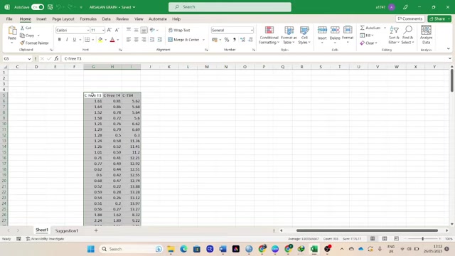
Ensure that your data is organized in a clear and consistent format, with column headers that accurately describe each data series. Excel uses these headers to generate Meaningful labels for your chart.
For example, if you want to create a chart showing the relationship between different thyroid hormone levels, you would select the columns containing the hormone data (e.g., Free T3, Free T4, TSH) along with any corresponding labels (e.g., patient IDs, dates).
When selecting your data, keep the following tips in mind:
- Include Headers: Always include column headers to provide context for your data series.
- Select Contiguous Data: Ensure that the data you select is contiguous, meaning there are no empty rows or columns within the selected range.
- Verify Data Types: Confirm that your data types are consistent (e.g., numerical data in numerical columns, text data in text columns).
Selecting the right data is crucial for generating an accurate and insightful chart. Take the time to organize and verify your data before proceeding to the next step.
Inserting a Chart
Once you have selected your data, the next step is to insert a chart. To do this, navigate to the Insert tab on the Excel ribbon.
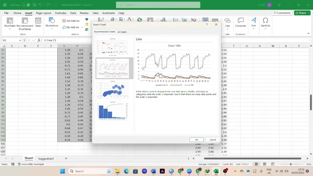
In the Charts section, you will find a variety of chart types to choose from. Alternatively, you can click the Recommended Charts button to have Excel suggest chart types based on your data.
To insert a chart, follow these steps:
- Click the Insert tab.
- In the Charts section, choose a chart type or click Recommended Charts.
- If you choose Recommended Charts, Excel will display a selection of chart types that it deems suitable for your data. You can preview each chart type to see how it will represent your data.
- Select the chart type that best fits your needs and click OK.
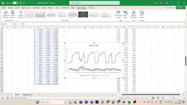
Excel will then insert the chart into your worksheet. From there, you can customize the chart to further refine its appearance and functionality.
Choosing the correct chart depends on the data you are visualizing. Consider the following:
- Line Charts: These are suitable for showing trends over time or continuous data.
- Bar Charts: These are used to compare different categories of data.
- Pie Charts: These are used to show how different parts contribute to the whole.
- Scatter Plots: These are useful for showing relationships between two different variables.
Customizing Your Chart
After inserting a chart, you can customize it to enhance its Clarity and visual appeal. Excel provides a range of customization options, including:
- Chart Title: Add a descriptive title to your chart to provide context.
- Axis Labels: Label the X and Y axes to indicate the data being represented.
- Data Labels: Display data values directly on the chart to improve readability.
- Legend: Include a legend to identify the different data series in your chart.
- Colors and Styles: Adjust the colors and styles of the chart elements to match your branding or preferences.
To customize your chart, click on the chart to activate the Chart Design and Format tabs on the Excel ribbon. These tabs contain a variety of tools for modifying the chart elements.
Some common customization tasks include:
- Changing the Chart Type: If you decide that a different chart type would better represent your data, you can easily switch to a different type using the Change Chart Type option on the Chart Design tab.
- Adding or Removing Chart Elements: You can add or remove chart elements such as titles, labels, legends, and gridlines using the Add Chart Element option on the Chart Design tab.
- Formatting Chart Elements: You can format individual chart elements such as data series, axes, and labels using the formatting options on the Format tab.
By customizing your chart, you can create a visualization that is both informative and visually appealing, effectively communicating your insights to your audience.
Key Features of Excel for Data Visualization
Excel's Essential Data Visualization Tools
Excel offers a variety of features that make it a powerful tool for data visualization:
-
Chart Recommendations: Excel's AI-powered chart recommendations suggest the most appropriate chart types based on the data you select. This feature helps users quickly create effective visualizations without needing to be experts in chart design.
-
PivotCharts: PivotCharts allow you to dynamically summarize and visualize large datasets. You can easily change the data being displayed by dragging and dropping fields, making it simple to explore different perspectives on your data.
-
Conditional Formatting: Conditional formatting helps you highlight important data points and trends. You can use rules to automatically format cells based on their values, making it easier to identify outliers and patterns.
-
Sparklines: Sparklines are small, inline charts that fit within a single cell. They provide a quick visual summary of trends in your data, making it easy to see patterns at a glance.
-
3D Maps: Excel's 3D Maps feature allows you to visualize geographical data on a 3D globe. This is useful for identifying Spatial patterns and trends in your data.
-
Data Analysis Toolpak: The Data Analysis Toolpak provides a range of statistical analysis tools that can be used to generate charts and graphs. This includes tools for histograms, scatter plots, and more.
-
Power BI Integration: Excel integrates seamlessly with Power BI, Microsoft's advanced business intelligence platform. This allows you to create more sophisticated visualizations and dashboards using Excel data.
By leveraging these features, you can transform your Excel data into compelling and informative visualizations that drive better decision-making.





Most people like


































Report
Please select a reason for reporting
- 13 Reasons to Switch from Snapchat to Text Messaging
- 7 Powerful Speech to Text Apps to Boost Productivity
- 10 Best Speech to Text Tools for Effortless Transcription
- 13 Free Tools to Easily Transcribe Audio to Text
- 15 Surprising Ways Google's Speech-to-Text Boosts Productivity
- 7 Best Free Online Audio to Text Transcription Tools
- 9 Tips to Transcribe Speech to Text Faster and Better
- 13 Best Speech to Text Software for Windows 10 in 2023
- 7 Tips for Choosing the Best Transcriber for Audio to Text
- 11 Reasons Why Dragon Speech-to-Text Apps are Game-Changers
- 6 Secrets to Enhance Your Speech to Text Transcription
- 6 Brilliant Ways to Boost Productivity with Talk-to-Text on Your MacBook
- 6 Ways Transcription Software Converts Audio to Text
- 8 Tips to Transcribe Speech to Text Like a Pro
- 6 Reasons IBM Watson Speech to Text is a Game-Changer
- 14 Powerful Ways Talk-to-Text Improves Your Workflow
- 12 Top Windows Speech-to-Text Software for Efficient Transcription
- 12 Game-Changing Benefits of Apple's Speech to Text Technology
- 9 Powerful Use Cases for AWS Speech to Text Technology
- 10 Easy Steps to Transcribe YouTube Videos to Text
- transcription audio en texte
- online audio transcription
- free audio file transcription
- free ai audio transcription
- audio transcription service
- audio transcription online free
- audio transcription free online
- audio to transcription software
- audio and transcript
- ai audio transcription free
- voice recording to text converter
- translate voice recording to text
- record voice to text
- audio recording to text converter
- voice recording and transcription
- chatgpt voice to text
- gmail voice to text
- speech to text reader
- speech to text ai free
- speech to talk
- How to Use AI Tools to Find Internal Linking Opportunities Across a Business Website
- Discover Your Perfect Haircut with AI Hairstyle Apps
- Free Reputation Calculator Tools: How They're Adapting to Score AI Visibility, Not Just Rankings
- Design Professional Flyers for Free on Your Phone
- Best Free Flyer Maker Apps for Android: Design Like a Pro
- How to Know If Your Business Is Ready for an AI Customer Service Agent
- Revolutionizing Storytelling: From Novels to Screenplays with AI
- Create Engaging Animated Explainer Videos with a Free AI Tool
- Stop Multi-Subscribing: Benchmark Top AI Visual Models in One Canvas
- Best Seedance 2.5 API Provider: Every Price on the Market, Checked at Source
- Top AI Social Media Management Tools: Automate Your Content Strategy
- Free AI Text to Video Generator: Create Stunning Videos from Text
- Discover 17 ChatGPT Alternatives: A Comprehensive Comparison
- Character.AI vs. Janitor AI: Which AI Chat Platform Reigns Supreme?
- Top Virtual Assistant Companies in 2026: Reviews, Pricing, and Plans Compared
- Unveiling FaceCheck.ID: Revolutionizing Reverse Image Searches with AI
- 11 Best AI Dialers in 2026: Features, Pricing, Pros and Cons
- How I Direct Consistent AI Clips: A Hands-On Guide to Multi-Model Generation
- A Realistic Review of the Photo Generator Image Tool
- Playwright MCP Server: Automated Web Testing with Agent Mode

Copyright ©2026 toolify