































Table of Contents
- Key Points
- Understanding Column Graph Tools in Adobe Illustrator
- Advanced Techniques for Column Graph Customization
- Step-by-Step Guide: Creating a Basic Column Graph
- Pricing and Licensing of Adobe Illustrator
- Evaluating Column Graphs: Pros and Cons
- Key Features for Enhancing Column Graphs
- Versatile Use Cases for Column Graphs
- Frequently Asked Questions About Column Graphs
- Related Questions about Chart and Graph


Understanding Column Graph Tools in Adobe Illustrator
What is the Column Graph Tool?
The Column Graph Tool in Adobe Illustrator is a specialized instrument designed to Visualize data in the form of vertical columns.
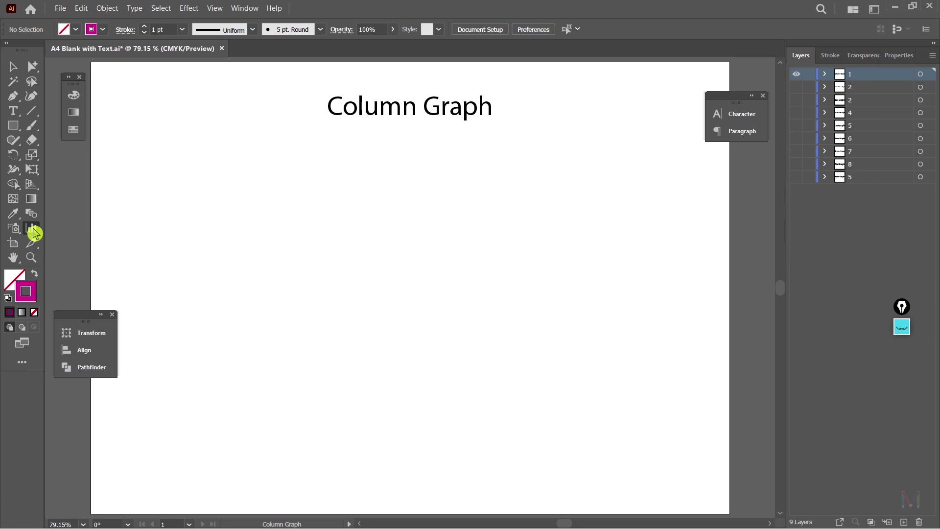
It's part of a suite of graph tools available within Illustrator, each serving different data representation needs. Column graphs are particularly effective for comparing different values across categories, making them ideal for presenting sales figures, survey results, or any dataset where you want to highlight differences in magnitude. The versatility of Adobe Illustrator allows for extensive customization of these graphs, far beyond what’s typically possible in spreadsheet software like Excel. By mastering this tool, designers and data visualizers can create visually compelling graphs that not only Present data accurately but also enhance the overall aesthetic of their projects.
Key Benefits of Using Column Graphs:
- Easy Comparison: Column graphs make it straightforward to compare values at a glance.
- Visual Appeal: Illustrator provides tools to create visually engaging graphs that capture attention.
- Customization: Extensive customization options allow for tailoring graphs to specific branding and design requirements.
Where to Find the Tool: You can find the Column Graph Tool (and other graph tools) in the Toolbox panel on the left side of your Illustrator workspace. By default, it is nested with other graph tools, so you might need to click and hold the graph tool icon to reveal the full menu and select the Column Graph Tool specifically.
Types of Graph Tools Available
Adobe Illustrator provides a range of graph tools designed to suit various data visualization needs. Each tool offers a unique way to represent data, catering to different types of datasets and presentation goals.
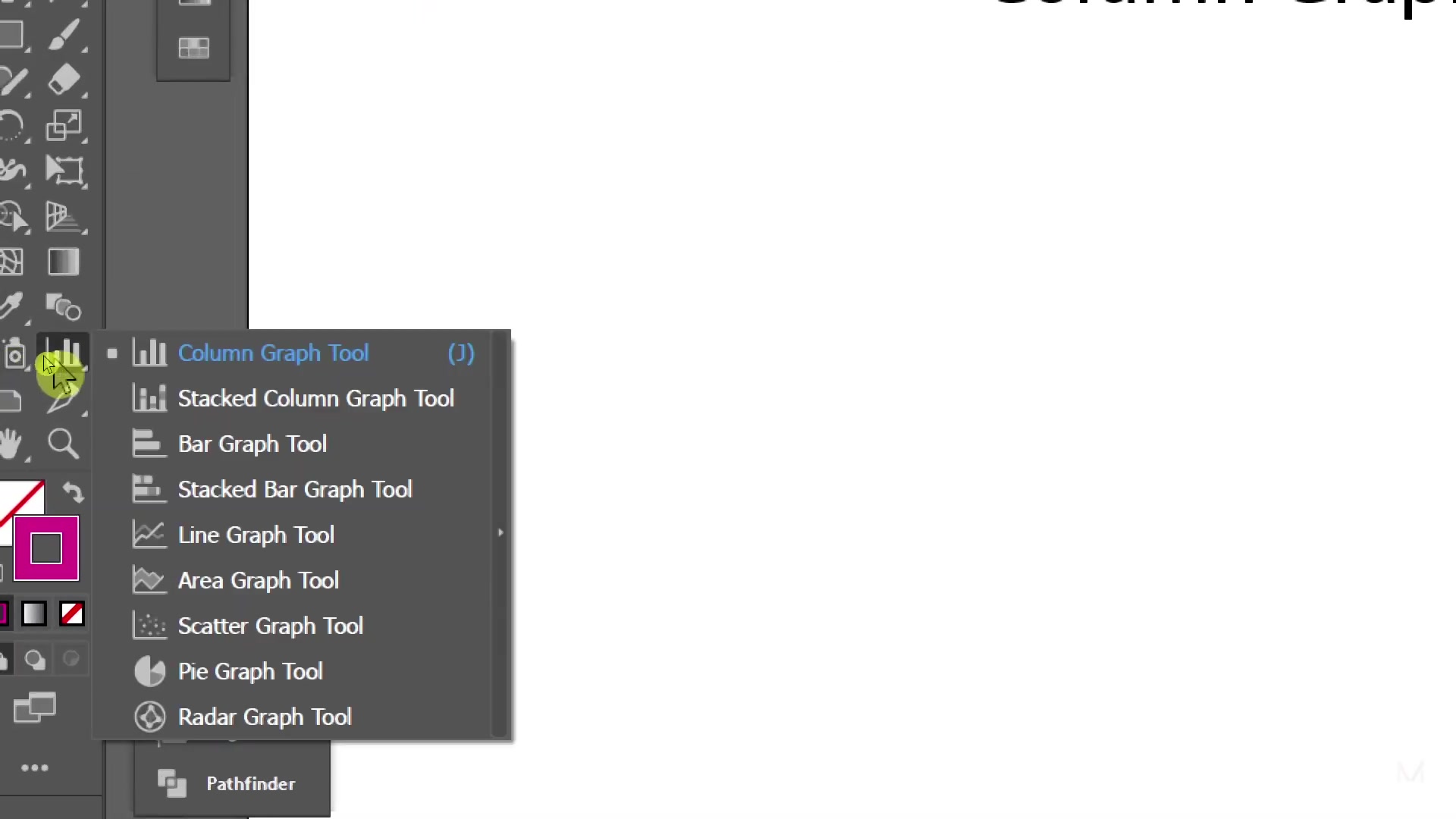
- Column Graph Tool: The standard column graph, ideal for comparing values across categories.
- Stacked Column Graph Tool: This tool displays data in stacked columns, showing both individual values and their contribution to the total.
- Bar Graph Tool: Similar to column graphs but with horizontal bars, often preferred when category names are long.
- Stacked Bar Graph Tool: Equivalent to stacked column graphs but with horizontal orientation.
- Line Graph Tool: Used to display trends over time, showing how values change continuously.
- Area Graph Tool: Similar to line graphs but with the area below the line filled in, emphasizing the magnitude of the values.
- Scatter Graph Tool: Useful for identifying correlations between two variables, plotting data points on a coordinate plane.
- Pie Graph Tool: Represents data as slices of a pie, showing the proportion of each category to the whole.
- Radar Graph Tool: Displays multivariate data in a circular format, useful for comparing multiple attributes of different items.
Understanding the strengths and weaknesses of each graph type is crucial for selecting the most effective tool for your data. While this guide focuses on the Column Graph Tool, it's worth exploring the other options to broaden your data visualization toolkit.
Step-by-Step Guide: Creating a Basic Column Graph
Step 1: Selecting the Column Graph Tool
First, locate the Column Graph Tool in the Toolbox panel.

As Mentioned earlier, it might be nested with other graph tools, so ensure you select the correct one from the menu. Once selected, your Cursor will change, indicating that you are ready to draw the graph on your artboard.
Step 2: Drawing the Graph Area
Click and drag on your artboard to define the area where you want the column graph to appear. The size of this area will determine the initial Dimensions of your graph. Don't worry too much about getting the exact size right at this stage; you can always resize it later. Once you release the mouse button, Illustrator will open a data input window.
Step 3: Inputting Your Data
The data input window is where you'll enter the information that will be represented in your column graph. You can either type the data directly into the cells or copy and paste it from a spreadsheet program like Excel. Ensure that your data is organized correctly, with categories in the first column and corresponding values in the subsequent columns. You can add new rows or columns as needed to accommodate your dataset. Once you've entered your data, click the Apply button (usually a checkmark icon) to generate the initial column graph.
Step 4: Customizing the Graph Appearance
After creating the basic graph, you can customize its appearance to match your branding and design preferences. This includes changing the colors of the columns, adding labels to the axes, adjusting the Font styles, and more. Illustrator offers a wide range of customization options, allowing you to fine-tune every aspect of your graph to achieve the desired look and feel. You can access these options through the Properties panel or by double-clicking on the graph to enter editing mode.





Most people like






































Report
Please select a reason for reporting
- 13 Reasons to Switch from Snapchat to Text Messaging
- 7 Powerful Speech to Text Apps to Boost Productivity
- 10 Best Speech to Text Tools for Effortless Transcription
- 13 Free Tools to Easily Transcribe Audio to Text
- 15 Surprising Ways Google's Speech-to-Text Boosts Productivity
- 7 Best Free Online Audio to Text Transcription Tools
- 9 Tips to Transcribe Speech to Text Faster and Better
- 13 Best Speech to Text Software for Windows 10 in 2023
- 7 Tips for Choosing the Best Transcriber for Audio to Text
- 11 Reasons Why Dragon Speech-to-Text Apps are Game-Changers
- 6 Secrets to Enhance Your Speech to Text Transcription
- 6 Brilliant Ways to Boost Productivity with Talk-to-Text on Your MacBook
- 6 Ways Transcription Software Converts Audio to Text
- 8 Tips to Transcribe Speech to Text Like a Pro
- 6 Reasons IBM Watson Speech to Text is a Game-Changer
- 14 Powerful Ways Talk-to-Text Improves Your Workflow
- 12 Top Windows Speech-to-Text Software for Efficient Transcription
- 12 Game-Changing Benefits of Apple's Speech to Text Technology
- 9 Powerful Use Cases for AWS Speech to Text Technology
- 10 Easy Steps to Transcribe YouTube Videos to Text
- transcription audio en texte
- online audio transcription
- free audio file transcription
- free ai audio transcription
- audio transcription service
- audio transcription online free
- audio transcription free online
- audio to transcription software
- audio and transcript
- ai audio transcription free
- voice recording to text converter
- translate voice recording to text
- record voice to text
- audio recording to text converter
- voice recording and transcription
- chatgpt voice to text
- gmail voice to text
- speech to text reader
- speech to text ai free
- speech to talk
- How to Use AI Tools to Find Internal Linking Opportunities Across a Business Website
- Discover Your Perfect Haircut with AI Hairstyle Apps
- Free Reputation Calculator Tools: How They're Adapting to Score AI Visibility, Not Just Rankings
- Design Professional Flyers for Free on Your Phone
- Best Free Flyer Maker Apps for Android: Design Like a Pro
- How to Know If Your Business Is Ready for an AI Customer Service Agent
- Revolutionizing Storytelling: From Novels to Screenplays with AI
- Create Engaging Animated Explainer Videos with a Free AI Tool
- Stop Multi-Subscribing: Benchmark Top AI Visual Models in One Canvas
- Best Seedance 2.5 API Provider: Every Price on the Market, Checked at Source
- Top AI Social Media Management Tools: Automate Your Content Strategy
- Free AI Text to Video Generator: Create Stunning Videos from Text
- Discover 17 ChatGPT Alternatives: A Comprehensive Comparison
- Character.AI vs. Janitor AI: Which AI Chat Platform Reigns Supreme?
- Top Virtual Assistant Companies in 2026: Reviews, Pricing, and Plans Compared
- Unveiling FaceCheck.ID: Revolutionizing Reverse Image Searches with AI
- 11 Best AI Dialers in 2026: Features, Pricing, Pros and Cons
- How I Direct Consistent AI Clips: A Hands-On Guide to Multi-Model Generation
- A Realistic Review of the Photo Generator Image Tool
- Playwright MCP Server: Automated Web Testing with Agent Mode

Copyright ©2026 toolify